Painting the Room: How Strategic Color Choices Transform Events Into Lasting Memories
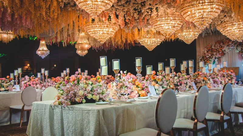
When a guest walks into a beautifully designed event space, their emotional response begins before a single word is spoken, before a dish is served, or a note of music is played. The colors surrounding them have already begun their work. For event designers operating at the highest level of the industry, understanding the psychology of color is not optional — it is foundational.
At Quality Event Design, the selection of a color palette is treated as a strategic decision, one that carries measurable consequences for guest experience, brand alignment, and — perhaps most critically — memory retention.
Why Color Is a Cognitive Experience, Not Just a Visual One
The human brain processes color in the limbic system, the region responsible for emotion and long-term memory formation. This means that the colors guests encounter at an event are not merely observed — they are felt. Research from the Institute for Color Research suggests that people make a subconscious judgment about an environment within 90 seconds of entering it, and up to 90 percent of that assessment is based on color alone.
For event planners, this statistic carries enormous implications. A corporate gala dressed in cool blues and silver tones communicates authority, precision, and professionalism — qualities that reinforce a company's brand identity. A wedding reception bathed in warm blush, champagne, and ivory evokes tenderness, romance, and intimacy. Neither outcome happens by accident. Both are the result of deliberate, informed design.
The Emotional Language of Individual Hues
Each color carries a distinct psychological signature, and skilled designers learn to read that language fluently.
Red and Deep Burgundy stimulate energy, passion, and urgency. These tones are powerful at fundraising galas and launch events where excitement and momentum are the intended emotional outcomes. However, used in excess, red can feel aggressive or overpowering, so it is most effective as an accent or focal-point color.
Blue, from Navy to Sky communicates trust, calm, and competence. It is among the most universally favored colors across American audiences and performs exceptionally well at corporate conferences, awards ceremonies, and events where credibility is paramount. Deeper blues suggest sophistication; lighter blues invite openness and ease.
Green, particularly in its sage and emerald variations, has surged in popularity across the US event industry, partly driven by broader cultural interest in wellness and sustainability. Green evokes balance, renewal, and natural elegance. It works beautifully at outdoor celebrations, wellness-focused retreats, and upscale garden parties.
Gold and Warm Amber signal luxury, achievement, and celebration. These tones are perennial favorites at milestone events — anniversaries, retirement dinners, and black-tie galas — because they carry an inherent sense of prestige without requiring excessive ornamentation.
White and Soft Neutrals create a sense of spaciousness, clarity, and refined simplicity. Rather than reading as absence of color, a thoughtfully curated neutral palette communicates confidence in restraint — a hallmark of truly sophisticated event design.
Color Contrast and the Architecture of Memory
Memory retention is not solely a function of individual colors; it is also shaped by contrast and visual hierarchy. Neuroscientific research on episodic memory indicates that humans are more likely to recall environments where visual information is organized in a clear, legible manner. Events that employ a dominant color, a secondary accent, and a neutral base create a visual rhythm that the brain finds easier to encode.
Consider a high-profile product launch held in New York City: a primary palette of deep charcoal and electric cobalt, punctuated by brushed-gold hardware and ivory linens. The contrast between dark and light, warm and cool, creates a dynamic tension that keeps the visual environment stimulating without becoming chaotic. Guests leave with a vivid mental snapshot — not just of the product, but of the entire sensory atmosphere.
This is intentional design at its most effective.
Lighting as the Great Modifier
No discussion of event color psychology is complete without addressing the transformative role of lighting. Ambient lighting can dramatically shift the perceived temperature and intensity of any color palette. Warm tungsten light deepens reds and golds while softening blues and greens. Cool LED lighting sharpens blues and silvers while draining warmth from earth tones.
At Quality Event Design, our production team works in close collaboration with lighting specialists to ensure that the colors selected during the design phase are rendered accurately — and beautifully — throughout every phase of the event, from cocktail hour to the final dance.
A palette that photographs magnificently under natural afternoon light may require significant lighting adjustments to maintain its integrity as the evening progresses. Experienced designers anticipate these transitions and plan accordingly.
Case Study Perspective: The Corporate Gala Reimagined
A recurring challenge in corporate event design is avoiding the visual monotony that so often characterizes large-scale professional gatherings. When a prominent financial services firm based in Chicago approached us to redesign their annual client appreciation dinner, their existing approach — standard black linens, white centerpieces, corporate-branded blue napkins — was functional but forgettable.
Our team proposed a shift to a palette of deep forest green, antique brass, and warm ivory, accented with living botanical elements. The green conveyed stability and growth — values central to the firm's identity — while the brass and ivory introduced warmth and approachability that the original palette lacked entirely. Post-event surveys revealed a 34 percent increase in guest-reported satisfaction scores compared to the previous year, with multiple attendees specifically noting the atmosphere as a highlight.
The product had not changed. The food and entertainment remained comparable. What changed was the psychological environment in which the evening unfolded.
Actionable Recommendations for Event Planners
For professionals seeking to elevate their color strategy, the following principles offer a practical starting point.
Begin with the emotional goal. Before selecting a single swatch, define the feeling you want guests to carry with them when they leave. Is it inspiration? Celebration? Trust? Serenity? Let that emotional target drive the palette, not the other way around.
Limit your primary palette to three to four tones. Visual complexity beyond this threshold tends to fragment the guest experience rather than unify it. Discipline in color selection is a mark of professional maturity.
Test colors in situ. Colors behave differently depending on the texture of the surfaces they occupy, the dimensions of the space, and the lighting conditions present. Always evaluate swatches in the actual venue before finalizing decisions.
Account for your audience's cultural context. While color psychology offers broad principles, cultural associations with specific hues can vary. White, for example, is associated with purity and celebration in most American contexts but carries connotations of mourning in certain Asian traditions — a distinction that matters significantly for multicultural events.
Revisit color choices seasonally. Palettes that feel fresh and resonant in autumn may feel incongruous in midsummer. Aligning color selection with seasonal expectations creates a sense of environmental harmony that guests may not consciously identify but will absolutely feel.
The Standard of Intentional Design
At Quality Event Design, we believe that every element of an event — from the grandest architectural installation to the color of a cocktail napkin — should serve a purpose. Color is among the most powerful tools in a designer's repertoire precisely because it operates below the level of conscious awareness. Guests do not analyze a palette; they absorb it.
When color selection is approached with the rigor and intentionality it deserves, the result is an event that does not merely look exceptional — it feels exceptional, and it is remembered long after the last guest has departed. That is the standard to which we hold every project we undertake.